BluKoo
Member
Registered: 8th Apr 02
Location: Stonehaven (Scotland)
User status: Offline
|
I'm designing a website for a client. I've been told to go with nice bright, bold and contrasting colours so hopefully this'll satisfy him.
Any thoughts on the design? It doesn't look cheap and nasty does it?
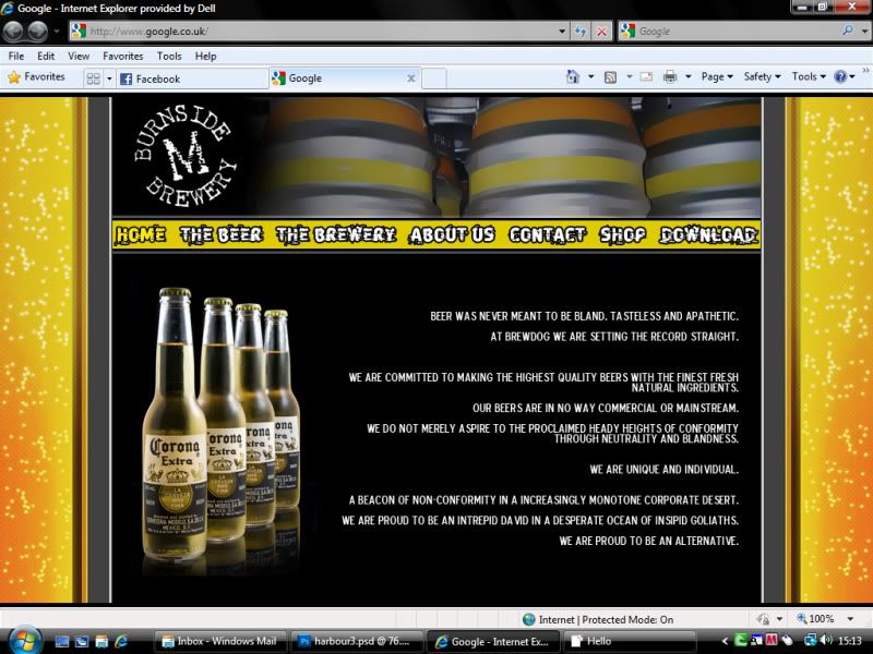
The text and bottles of corona are just gap fillers until I do some product photography for him.
[Edited on 03-09-2010 by BluKoo]
|
Jamie-C
Member
Registered: 3rd Jun 08
Location: Ballycastle
User status: Offline
|
The yellow bits up the side make it look as if the webpage doesn't fit on the screen.
|
AndyKent
Member
Registered: 3rd Sep 05
User status: Offline
|
I like it, though as said I'd probably tone down the orange to more of a brown colour (but not mich darker). I'd also change the font in the main navigation to something slightly simpler and easier to read.
|
VrsTurbo
Premium Member
Registered: 8th Jun 10
User status: Offline
|
the yellow bits should have a head
|
BluKoo
Member
Registered: 8th Apr 02
Location: Stonehaven (Scotland)
User status: Offline
|
The client actually requested a font like that. I think its easy enough to read. Especially on a larger scale.
Thanks for the input.
|
Rab
Member
Registered: 10th Jun 07
Location: Alloa, Scotland Drives: Subaru Hawkeye STi
User status: Offline
|
I think it looks quite good!
Although I would do something with the body text, perhaps take away the capitals and have a subtle (very) background behind the text only. Or an effect.
Rab
|
3CorsaMeal
Member
Registered: 11th Apr 02
User status: Offline
|
to my expert eye its looks like its aimed towards younger people, and the menu bar font looks a little like a weedshop font/effect
looks good though, the colours work, and i agree the bits at the sides need a head
|
AndyKent
Member
Registered: 3rd Sep 05
User status: Offline
|
It's not that it's difficult read exactly, but i'd say its not easy enough - a bit too fancy for no reason.
If that's what they want though, who am I to argue 
|
ShEp
Member
Registered: 9th Aug 05
Location: Dingwall, Highland
User status: Offline
|
Why does it go on about being so Innovative and individual and has pictures of Corona on it? 
|
BluKoo
Member
Registered: 8th Apr 02
Location: Stonehaven (Scotland)
User status: Offline
|
As it says on my first post, "The text and bottles of corona are just gap fillers until I do some product photography for him."
|


