JonnyJ
Member
Registered: 23rd Sep 05
Location: Scotchland
User status: Offline
|
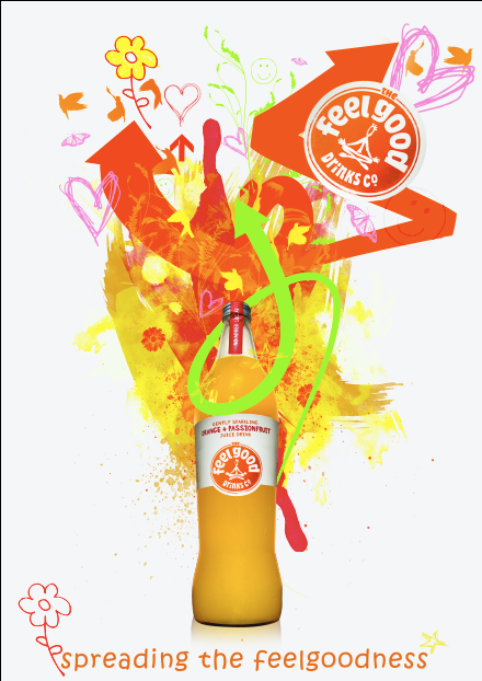
Just doing a brief for uni for Feel Good Drinks. All the brief says is to use their slogan "Spreading the feelgoodness" however you like. Just come up with a little design today, wondered what everyone thought of it.
The idea is the bottle is packed with stuff that makes you feel good and is exploding onto the page.
Anyway:

[Edited on 20-02-2008 by JonnyJ]
|
Robin
Premium Member
 Registered: 7th Jan 04
Location: Northants Drives: Clio 182 Cup
User status: Offline
|
Looks a bit, erm.... gay? 
|
Shane
Member
Registered: 10th Jan 04
User status: Online
|
quote:
Originally posted by Robin
Looks a bit, erm.... gay?
you must feel right at home then 
|
JonnyJ
Member
Registered: 23rd Sep 05
Location: Scotchland
User status: Offline
|
Excellent 
|
Ian
Site Administrator
 Registered: 28th Aug 99
Location: Liverpool
User status: Offline
|
Looks good but I would perhaps introduce a bit more contrast between the objects near the top of the bottle. From a distance it is just a mass of colour with not much definition on the arrows.
Works well though. Certainly satisfies the brief.
[Edited on 17-02-2008 by Ian]
|
Tommy L
Member
Registered: 21st Aug 06
Location: Northampton Drives: Audi wagon
User status: Offline
|
aww thats nice
|
CorsAsh
Member
Registered: 19th Apr 02
Location: Munich
User status: Offline
|
Looks gay, but right for the product. Speak to Alleh, she needs something doing and you'll be better at it than me...
|
Hoddo
Member
Registered: 7th Nov 06
Location: Wallisdown, Bournemouth
User status: Offline
|
what typeface is that at the bottom?
Not sure about the green arrow, I feel it might work slightly transparent? or maybe even a more matching colour
|
JonnyJ
Member
Registered: 23rd Sep 05
Location: Scotchland
User status: Offline
|
quote:
Originally posted by CorsAsh
Looks gay, but right for the product. Speak to Alleh, she needs something doing and you'll be better at it than me...
..........
|
Hoddo
Member
Registered: 7th Nov 06
Location: Wallisdown, Bournemouth
User status: Offline
|
quote:
Originally posted by Ian
Looks good but I would perhaps introduce a bit more contrast between the objects near the top of the bottle. From a distance it is just a mass of colour with not much definition on the arrows.
Works well though. Certainly satisfies the brief.
[Edited on 17-02-2008 by Ian]
lol, you worded it better 
|
Hammer
Member
Registered: 11th Feb 04
User status: Offline
|
I reckon the bottle could be doing with being bigger i.e. the focal point
|
CorsAsh
Member
Registered: 19th Apr 02
Location: Munich
User status: Offline
|
quote:
Originally posted by JonnyJ
quote:
Originally posted by CorsAsh
Looks gay, but right for the product. Speak to Alleh, she needs something doing and you'll be better at it than me...
..........
It's graphic, but not explicit. Ask for her briefs.
|
Paul_J
Member
Registered: 6th Jun 02
Location: London
User status: Offline
|
I can't believe they gave you the slogan
"spreading the feelgoodness"
Sounds so grammatically incorrect.
|
Hoddo
Member
Registered: 7th Nov 06
Location: Wallisdown, Bournemouth
User status: Offline
|
quote:
Originally posted by Hammer
I reckon the bottle could be doing with being bigger i.e. the focal point
yeah, seems a bit lost near the neck of the bottle
|
JonnyJ
Member
Registered: 23rd Sep 05
Location: Scotchland
User status: Offline
|
quote:
Originally posted by Ian
Looks good but I would perhaps introduce a bit more contrast between the objects near the top of the bottle. From a distance it is just a mass of colour with not much definition on the arrows.
Works well though. Certainly satisfies the brief.
[Edited on 17-02-2008 by Ian]
Yeah i know what you mean, ill see what i can do
Having so much colour was always going to be an issue, ive been messing around with things all day
Hoddo - Typeface is ITC Kristen
|
CorsAsh
Member
Registered: 19th Apr 02
Location: Munich
User status: Offline
|
quote:
Originally posted by Paul_J
I can't believe they gave you the slogan
"spreading the feelgoodness"
Sounds so grammatically incorrect.
It's wrong so it sticks in your head I guess.
|
JonnyJ
Member
Registered: 23rd Sep 05
Location: Scotchland
User status: Offline
|
quote:
Originally posted by Paul_J
I can't believe they gave you the slogan
"spreading the feelgoodness"
Sounds so grammatically incorrect.
Is there any wonder kids cant spell nowadays
|
Hammer
Member
Registered: 11th Feb 04
User status: Offline
|
It's the companies moniker is it not?
|
Ian
Site Administrator
Registered: 28th Aug 99
Location: Liverpool
User status: Offline
|
Not sure I would have the flower and star so close to it either.
|
JonnyJ
Member
Registered: 23rd Sep 05
Location: Scotchland
User status: Offline
|
Yep
http://www.feelgooddrinks.com/
|
JonnyJ
Member
Registered: 23rd Sep 05
Location: Scotchland
User status: Offline
|
quote:
Originally posted by Ian
Not sure I would have the flower and star so close to it either.
Move further away or ditch them/one. Im not too keen on the flower myself.
|
Hoddo
Member
Registered: 7th Nov 06
Location: Wallisdown, Bournemouth
User status: Offline
|
bottom left flower by typeface isn't needed. I think the slogan should contrast nicely but not be involved in the busyness. purely linked by contrast.
|
JonnyJ
Member
Registered: 23rd Sep 05
Location: Scotchland
User status: Offline
|
Very good point Hoddo. Noted
Good stuff so far guys cheers. I like to hear other peoples views as when your designing something for ages you get sucked into it and you can see the whole picture.
|
Hoddo
Member
Registered: 7th Nov 06
Location: Wallisdown, Bournemouth
User status: Offline
|
I love the Crits we do at Uni, we meet up 2/3 times a project in small groups of 8 or so and crit each others ideas. I really enjoy it.
|
Hoddo
Member
Registered: 7th Nov 06
Location: Wallisdown, Bournemouth
User status: Offline
|
I think if you wanted to keep the star with the slogan then maybe have one around where the flower is but maybe a different colour.
|


